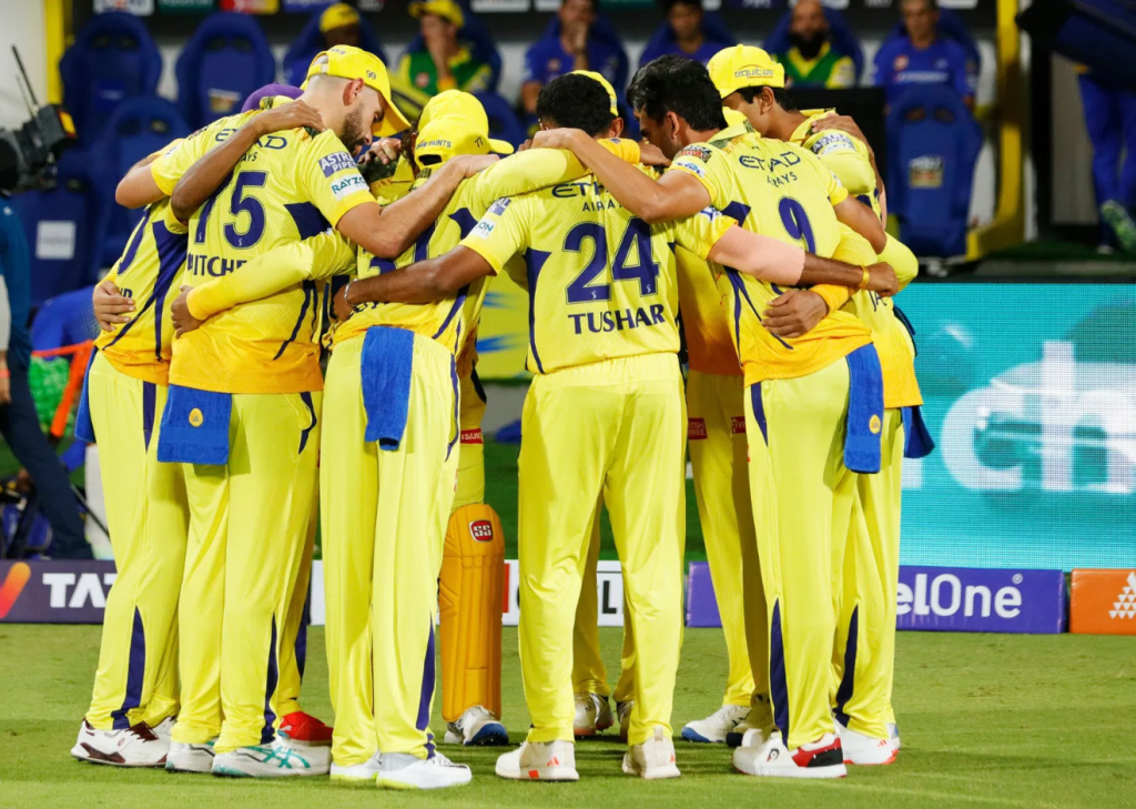
The Indian Premier League (IPL) is not just a cricket tournament; it’s a global phenomenon. Since its inception in 2008, the IPL has captured the imagination of millions, blending cricket with entertainment, glamour, and business. Among the many elements that contribute to its identity, the IPL logo stands out as an iconic symbol of the league’s brand. But who or what inspired the IPL logo, and how was it designed to encapsulate the spirit of this revolutionary tournament? Let’s dive deep into the story behind the IPL logo.
The Evolution Of The IPL Logo
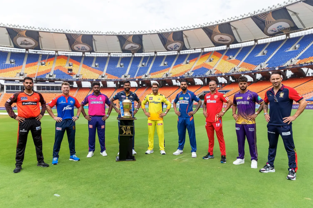
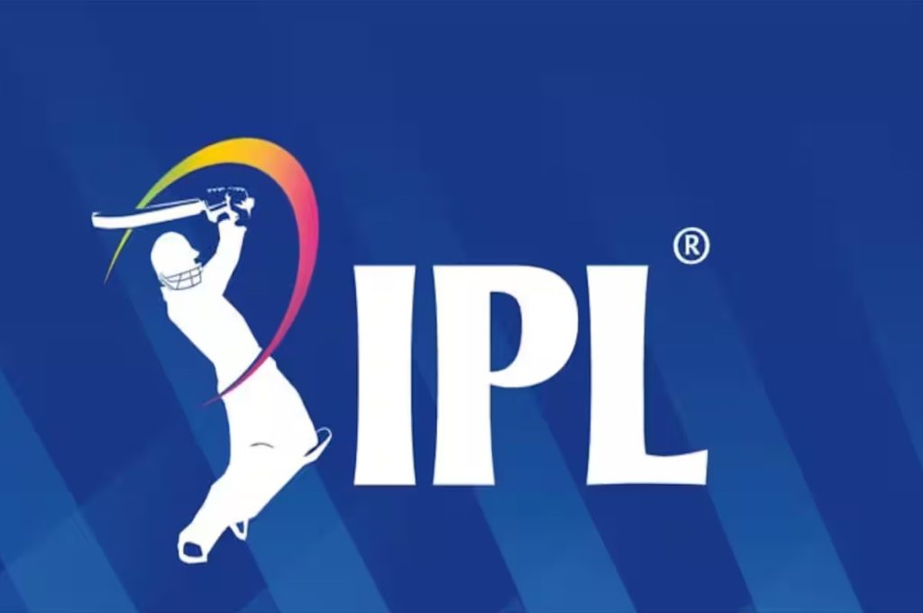
The IPL logo, with its dynamic depiction of a batsman in action, represents the essence of the game: energy, skill, and entertainment. Its design reflects not only the competitive spirit of the league but also its innovative and inclusive approach to cricket.
To understand the inspiration behind the IPL, let’s explore its elements:
| Logo Element | Description | Symbolism |
|---|---|---|
| Batsman Silhouette | A player in mid-swing with a bat raised high. | The excitement and dynamism of cricket. |
| Curved Strokes | Flowing lines that form the base of the design. | Energy, motion, and fluidity. |
| Blue and Gold Colors | Blue for trust and stability; gold for prestige and glamour. | Represents the league’s values and stature. |
| Typography | Bold, modern font for “IPL.” | Professionalism and modernity. |
Inspiration Behind The Logo
The logo is believed to have drawn inspiration from multiple sources, combining elements of:
1. Cricket Itself
The primary inspiration for the IPL logo comes from the game of cricket. The silhouette of a batsman symbolizes the central role of players in the league. The batsman’s pose, mid-swing, highlights the action-packed nature of the tournament, where every shot and delivery matters.
2. The Global Sports Landscape
The IPL took cues from other global sports leagues like the NBA (National Basketball Association) and the EPL (English Premier League). These leagues have distinct logos that embody their brand values, and the IPL’s creators aimed to achieve a similar level of recognition. The dynamic design of the batsman is reminiscent of the iconic NBA logo’s player silhouette.
3. Indian Culture and Festivity
India’s vibrant culture and love for cricket play a significant role in the logo’s design. The curved strokes evoke a sense of celebration and movement, much like the festive atmosphere that surrounds IPL matches.
4. Innovation and Entertainment
The IPL’s identity as a fusion of cricket and entertainment is reflected in this. The modern typography and energetic design represent the league’s innovative approach and its appeal to younger audiences.
The Process Behind The Design
The Indian Premier League logo was designed under the guidance of the Board of Control for Cricket in India (BCCI) and a team of branding experts. The process involved:
Understanding the Brand Identity: The designers first analyzed what the Indian Premier League represented: a mix of cricket, entertainment, and business. They aimed to create a logo that resonated with fans and stakeholders alike.
Sketching Initial Concepts: Early drafts of the logo included various depictions of cricketing actions, such as batting, bowling, and fielding. The batsman silhouette was ultimately chosen for its universal appeal and connection to cricket fans.
Finalizing the Design: After multiple iterations, the design was finalized with input from the BCCI and IPL stakeholders. The chosen color scheme, fonts, and overall layout were carefully curated to align with the league’s vision.
How The Indian Premier League Logo Compares To Other Cricket League Logos
To understand the uniqueness of the IPL logo, let’s compare it with the logos of other popular cricket leagues:
| League | Logo Description | Key Features |
|---|---|---|
| IPL | Batsman silhouette, blue and gold colors, bold font. | Dynamic, celebratory, cricket-focused. |
| Big Bash League (BBL) | Shield-shaped logo with bold letters “BBL.” | Simplistic, modern, shield symbolizes strength. |
| Pakistan Super League (PSL) | Green color palette with a cricketer in action. | Emphasizes national identity and cricketing spirit. |
| Caribbean Premier League (CPL) | Multicolored design with a carnival vibe. | Represents the festive culture of the Caribbean. |
The Indian Premier League logo stands out due to its combination of elegance and energy, striking a balance between professionalism and excitement.
The Role Of The IPL Logo In Brand Building
The Indian Premier League logo has been instrumental in establishing the league’s brand identity. Its impact can be seen in:
Global Recognition The logo is instantly recognizable, even among casual cricket fans. It has become a symbol of the IPL’s global appeal and stature.
Merchandising The IPL logo is prominently featured on merchandise like jerseys, caps, and accessories, contributing significantly to the league’s revenue.
Fun Facts About The IPL Logo
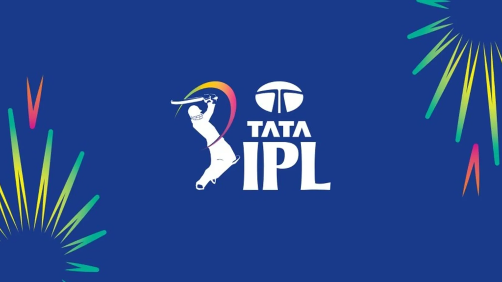
Hidden Symbolism: The curved strokes below the batsman can also be interpreted as a cricket ball’s trajectory, adding depth to the design.
Initial Reception: When the logo was unveiled in 2008, it received widespread praise for its modern and energetic look.
Logo Evolution: While the core design has remained the same, minor tweaks have been made over the years to keep it fresh and relevant.
The Future Of The Indian Premier League Logo
As the Indian Premier League continues to grow, the logo is likely to evolve to reflect the league’s changing dynamics. However, the core elements that make it iconic—the batsman, the energy, and the celebration of cricket—will remain integral to its design.
The Indian Premier League logo is much more than a design; it’s a symbol of cricketing excellence, entertainment, and global appeal. Inspired by cricket, global sports branding, and India’s cultural vibrancy, the logo captures the essence of the IPL perfectly. As the league scales new heights, the logo will continue to be a beacon of its identity, cherished by fans worldwide.
